Stocks & Equities
“What keeps us up at night? Well I can’t speak for the others, having spoken too much already to please PIMCO’s marketing specialists, but I will give you some thoughts about what keeps Mohamed and me up at night. Mohamed, the creator of the “New Normal” characterization of our post-Lehman global economy, now focuses on the possibility of a” T junction” investment future where markets approach a time-uncertain inflection point, and then head either bubbly right or bubble-popping left due to the negative aspects of fiscal and monetary policies in a highly levered world.”
 Ed Note: More key excerpts from Bill’s Newsletter: On the Wings of an Eagle
This year’s April taper talk by the Federal Reserve is perhaps a good example of this forward path of asset returns. Admittedly the reaction in the bond market was rather sudden and it precipitated not only the disillusioning of bond holders, but also an increase in redemptions in retail mutual fund space. But then the Fed recognized the negative aspects of “financial conditions,” postponed the taper, and interest rates came back down.Sort of a reverse “Sisyphus” moment – two steps upward, one step back as it applies to yields.
… investors are all playing the same dangerous game that depends on a near perpetual policy of cheap financing and artificially low interest rates in a desperate gamble to promote growth.The Fed, the BOJ (certainly), the ECB and the BOE are setting the example for global markets, basically telling investors that they have no alternative than to invest in riskier assets or to lever high quality assets. “You have no other choice,” their policies insinuate. “Get used to negative real interest rates, move out on the risk spectrum and in the process help heal the real economy,” they seem to command.
Stock investors, however, were only mildly discouraged and continued their faith-based, capital gain dependent investments despite what should be the obvious conclusion that QE and low interest rates were as critical to their market as they were to bonds. “What other choice do we have?” has become the mantra of stock investors globally, which speaks more to desperation than logical thinking.
… Deep in the bowels of central banks research staffs must lay the unmodelable fear that zero-bound interest rates supporting Dow 16,000 stock prices will slowly lose momentum after the real economy fails to reach orbit, even with zero-bound yields and QE.
For the full article continue reading On the Wings of an Eagle HERE

Will the Strong Resistance Zone Stop the Oil-Stocks-to-Oil Ratio’s Rally?
In our last commentary on oil stocks from Nov. 20, we examined the NYSE Arca Oil Index (XOI) to find out what the current outlook for oil stocks was. In the summary, we wrote that the combination of a strong resistance level (the upper line of the smaller rising wedge) and the position of the RSI may encourage sellers to lock profits and trigger another correction in the coming days.
In the two following days, oil stocks extended their rally and hit a fresh annual high at 1,504. Despite this improvement, they reversed course and the breakout above the major medium-term resistance and psychological barrier at 1,500 was invalidated. On top of that, the oil stock index also invalidated the breakout above the previous 2013 high.
These strong bearish signals encouraged us to examine the oil-stocks-to-oil ratio once again. However, today we’ll check this ratio to find out what impact it could have on future oil stocks’ moves.
At the beginning, we want to emphasize a strong positive correlation between the ratio and the oil stock index in recent months. When we compare the situation in both cases, we clearly see that the entire Sept.-Nov. rally in the XOI was in perfect tune with the ratio’s rally. Please note that in 2012 and also at the beginning of 2013, higher values of the ratio didn’t correspond to the price action in the oil socks index as precisely as they do now (we marked these cases with green rectangles on the weekly chart). If this strong positive relationship between the XOI and the ratio remains in place, we can find interesting tips analyzing the charts below. Let’s start with the long-term chart (charts courtesy by http://stockcharts.com).
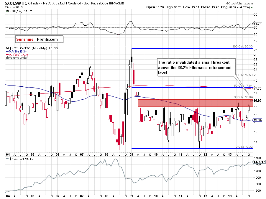
Looking at the above chart, we see that the ratio reached the 38.2% Fibonacci retracement level (based on the entire 2009-2011 decline). As you can see, there was a small breakout above this strong resistance level, but it was invalidated, which is a bearish signal. Additionally, the ratio still remains in the gap between the April 2009 low and May 2009 high (marked with the red rectangle), which is not supporting further growth. From this perspective, the implications for oil stocks are bearish.
Now, let’s zoom in on our picture and examine the weekly chart.
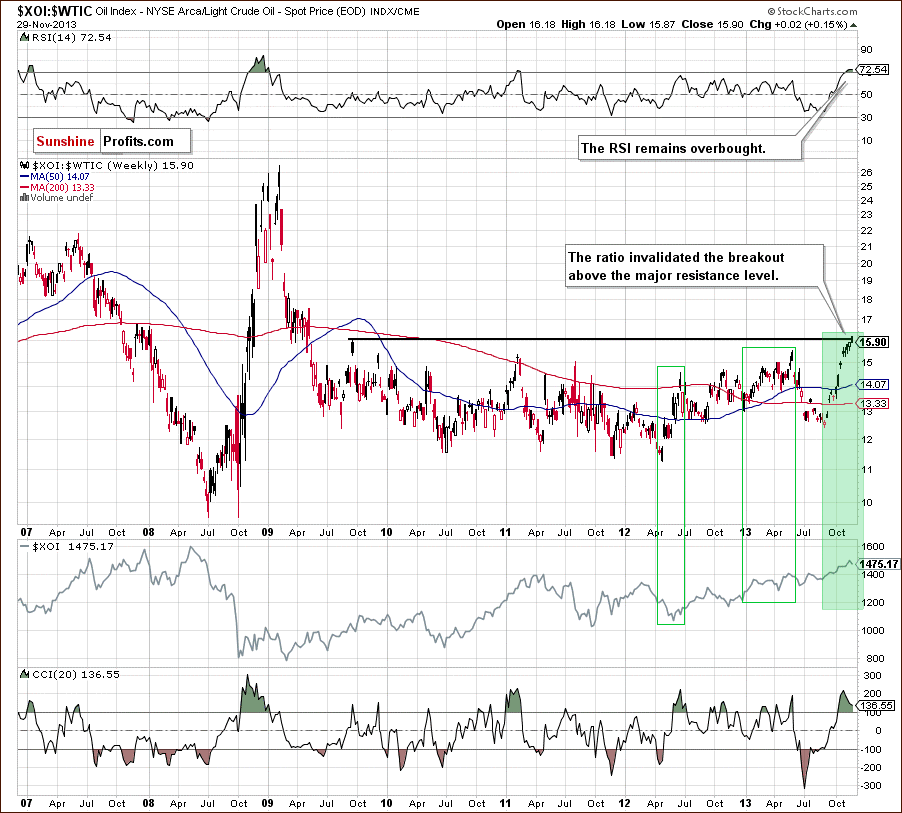
The first thing that catches the eye on the above chart is an invalidation of the breakout above the resistance level created by the September 2009 high, which is slightly below the 38.2% Fibonacci retracement (marked on the previous chart). An invalidation by itself is a bearish signal, which, in combination with the position of the RSI, suggests further deterioration in the ratio.
When we factor in the position of the CCI, we clearly see that the indicator is extremely overbought. On top of that, there is a negative divergence between this indicator and the recent upswing in ratio, which is another bearish signal. From this perspective, the implications for the oil stock index are also bearish.
Now, let’s check the short-term outlook.
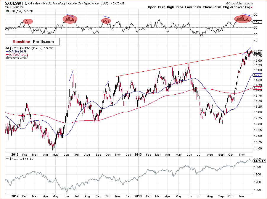
Looking at the above chart, we see that last week the ratio moved higher and broke above the previous high. With this upward move, the ratio broke above the medium-term rising resistance line based on the November 2012 and May 2013 highs (marked with the red line). However, the breakout was invalidated, which does not bode well for the ratio.
Additionally, we clearly see a deepening divergence between the RSI and the ratio. At this point it’s worth noting that a similar divergence between the RSI and the XOI triggered a correction in the previous week in the oil stock index. Therefore, taking into account the strong positive correlation between the ratio and oil stocks, if the ratio declines in the coming days, the XOI will likely extend its decline.
Summing up, connecting the long-, medium- and the short-term pictures, we clearly see that the ratio reached a strong resistance zone created by the long-, medium- and short-term lines. Although we saw breakouts above them, they all were invalidated. This is a strong negative signal for oil stocks holders, which suggests that further declines are just around the corner.
Thank you.
Nadia Simmons
Sunshine Profits‘ Crude Oil Expert
* * * * *
Disclaimer
All essays, research and information found above represent analyses and opinions of Nadia Simmons and Sunshine Profits’ associates only. As such, it may prove wrong and be a subject to change without notice. Opinions and analyses were based on data available to authors of respective essays at the time of writing. Although the information provided above is based on careful research and sources that are believed to be accurate, Nadia Simmons and his associates do not guarantee the accuracy or thoroughness of the data or information reported. The opinions published above are neither an offer nor a recommendation to purchase or sell any securities. Nadia Simmons is not a Registered Securities Advisor. By reading Nadia Simmons’ reports you fully agree that he will not be held responsible or liable for any decisions you make regarding any information provided in these reports. Investing, trading and speculation in any financial markets may involve high risk of loss. Nadia Simmons, Sunshine Profits’ employees and affiliates as well as members of their families may have a short or long position in any securities, including those mentioned in any of the reports or essays, and may make additional purchases and/or sales of those securities without notice.

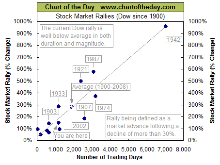
The Dow just made another all-time record high. To provide some further perspective to the current Dow rally, all major market rallies of the last 113 years are plotted on today’s chart. Each dot represents a major stock market rally as measured by the Dow with the majority of rallies referred to by a label which states the year in which the rally began. For today’s chart, a rally is being defined as an advance that follows a 30% decline (i.e. a major bear market). As today’s chart illustrates, the Dow has begun a major rally 13 times over the past 113 years which equates to an average of one rally every 8.7 years. It is also interesting to note that the duration and magnitude of each rally correlated fairly well with the linear regression line (gray upward sloping line). As it stands right now, the current Dow rally that began in March 2009 (blue dot labeled you are here) would be classified as well below average in both duration and magnitude. However, the magnitude of the current post-financial crisis rally has now reached median status — its magnitude is greater than six and less than six Dow rallies since 1900.
Quote of the Day
“An expert is someone who has succeeded in making decisions and judgments simpler through knowing what to pay attention to and what to ignore.” – Edward de Bono
Events of the Day
November 27, 2013 – Hanukkah (1st day)
November 28, 2013 – Thanksgiving Day
December 10, 2013 – Nobel Prizes awarded (announced in October)
Stocks of the Day
— Find out which stocks investors are focused on with the most active stocks today.
— Which stocks are making big money? Find out with the biggest stock gainers today.
— What are the largest companies? Find out with the largest companies by market cap.
— Which stocks are the biggest dividend payers? Find out with the highest dividend paying stocks.
— You can also quickly review the performance, dividend yield and market capitalization for each of the Dow Jones Industrial Average Companies as well as for each of the S&P 500 Companies.

“It deserves emphasis that a 6-1/2 percent unemployment rate and inflation one to two years ahead that is 1/2 percentage point above the Committee’s 2 percent objective are thresholds for possible action, not triggers that will necessarily prompt an immediate increase in the FOMC’s target rate.”
Stepping aside by Bernanke remains a bit of a mystery, about which nobody cares. Why is he quitting his office? He was considered as the most competent man for the job – sophisticated money printing analyst, who is brilliant and capable of comprehending and directing Fed’s special operations. Now, he shall be succeeded by another brilliant person, who believes in those operations. Why then change? Two possible answers arise. The first one – Bernanke is tired and has had enough. Not only the experience was exhausting, but also the criticism was stressful. The second one – Bernanke stopped believing in continuation of special operations, and was interested in stepping back. Since this was rejected as unacceptable, so he had to step back. Let us not forget that in his texts before he was chosen as the Fed’s chairman he warned that the special operations may not work that well, because they could create a specific cocoon of various assets disconnected from the real pricing process (exactly what has happened!).
 The certain fact is that Yellen is ready to continue with Fed’s expansionary operations. Therefore no tapering on the horizon so far. More money printing means greater chance for gold price to rise in the coming years.
In discussing unconventional tools in the realms of zero interest rates Yellen indicated that tapering is not on the horizon as long as two key variables remain at specific level. If the unemployment rate stays over 6,5 percent and inflation does not reach levels permanently higher than 2 percent goal, then the Fed is staying on the same course. This is basically what Bernanke was suggesting, but with higher emphasis on those specific levels. Bernanke left some uncertainty in his statements. Yellen is clear: we print until unemployment is over 6.5 and as long as the official inflation rate does not reach unacceptable levels.
Actually even more, because she highlighted that under those conditions Fed’s action is only “possible”, and not automatic. Seeing her concern about labor markets, it can mean that even if the official rate stays below 6.5 percent, then the Fed could still go on.
Yellen believes in the classical Keynesian framework: spending keeps the economy going. As long as the inflation rate is not running away, we should keep adding more money. If there is no direct inflationary pressure, and the economy is in recession, then spending is too low.
Well, this is all good news for gold bugs. If the central banker can do something for them, I guess the best way is to run the printing press.
The above is based on the November Market Overview report. We have just posted the December issue entitled “Tapering is not Tightening: Decomposition of Tapering” in which we discuss why tapering is not the same thing as tightening, why tapering has already happened in 2010 and what kind of tapering can actually take place. If you’re interested in the above and their implications on precious metals and your portfolio, we invite you to subscribe and read the latest Market Overview report.
Thank you.
Matt Machaj, PhD
Sunshine Profits‘ Market Overview Editor
Gold Market Overview at SunshineProfits.com
* * * * *
Disclaimer
All essays, research and information found above represent analyses and opinions of Matt Machaj, PhD and Sunshine Profits’ associates only. As such, it may prove wrong and be a subject to change without notice. Opinions and analyses were based on data available to authors of respective essays at the time of writing. Although the information provided above is based on careful research and sources that are believed to be accurate, Matt Machaj, PhD and his associates do not guarantee the accuracy or thoroughness of the data or information reported. The opinions published above are neither an offer nor a recommendation to purchase or sell any securities. Matt Machaj, PhD is not a Registered Securities Advisor. By reading Matt Machaj’s, PhD reports you fully agree that he will not be held responsible or liable for any decisions you make regarding any information provided in these reports. Investing, trading and speculation in any financial markets may involve high risk of loss. Matt Machaj, PhD, Sunshine Profits’ employees and affiliates as well as members of their families may have a short or long position in any securities, including those mentioned in any of the reports or essays, and may make additional purchases and/or sales of those securities without notice.

-
I know Mike is a very solid investor and respect his opinions very much. So if he says pay attention to this or that - I will.
~ Dale G.
-
I've started managing my own investments so view Michael's site as a one-stop shop from which to get information and perspectives.
~ Dave E.
-
Michael offers easy reading, honest, common sense information that anyone can use in a practical manner.
~ der_al.
-
A sane voice in a scrambled investment world.
~ Ed R.
Inside Edge Pro Contributors

Greg Weldon

Josef Schachter

Tyler Bollhorn

Ryan Irvine

Paul Beattie

Martin Straith

Patrick Ceresna

Mark Leibovit

James Thorne

Victor Adair