

![]()
In This Week’s Issue:
- Weekly Commentary
- Strategy of the Week
- Stocks That Meet The Featured Strategy
Stockscores Market Minutes Video – Profit Clumps
Profits from the market don’t come in a predictable, steady flow, they come in clumps. That plus this week’s stock market analysis. Click Here to Watch
To get instant updates when I upload a new video, subscribe to the Stockscores YouTube Channel
Trader Training – Simple Rules of Chart Analysis
Stock charts tell me everything that I need to know to do my analysis. They tell me how people feel about a stock, whether there are good things happening within the company’s business, how the economy is affecting the company and, most importantly, what the potential for price change is.
Here are some simple rules of chart reading that I think anyone analyzing charts should keep in mind.
Prices That Fall in to Support Will Bounce at Support
Support and resistance are important concepts of chart analysis. Support is a floor price that has been formed by the market over time, it is a low price point where the price trend stopped going down and started to go up. Chart readers look for breaks through support as a signal that a down trend is beginning.
However, that is not always the case. If a stock’s price is falling day after day, it is likely to bounce around support but it may go through support temporarily. Therefore, don’t short breaks through support if the break comes after a number of days of downward price movement. Prices in free fall will usually bounce around support.
Prices that Consolidate Before Breaking Support Will Trend Lower
Here is how to apply the sell on a break of support rule. If prices are trending sideways with relatively low volatility at or near an area of price support and then make a downward move through support, the stock is likely going in to a downward trend. The difference here is that the downtrend is just starting with an initial break through support.
You can reverse these rules for resistance and upside breakouts as well.
Breakouts From Low Price Volatility are Reliable
What does it mean when stocks trend sideways with very little price volatility? It is more than just a boring chart, it means that buyers and sellers agree about what the stock is worth. It is a display of confidence in the value given to the stock.
Therefore, if the stock price breaks from this period of confidence, it implies that there is new information that justifies the price move. This usually comes in the early stages of a trend; as more investors learn about the new information, more people will jump in to the stock and carry it farther along its trend.
This means that identifying breaks from low price volatility is an important way to catch market beating trends early.
Prices That Run Away From the Trend Line Come Back to the Trendline
In the long term, prices tend to trend in a linear fashion. That means you can draw a straight line across the bottoms of an up trend or a straight line across the tops of a down trend.
However, along the way, prices will often move away from this straight line. This happens because investors get emotional and either chase the stock higher with greed or force the stock quickly lower with fear.
The emotion eventually comes out of the market, bringing the stock back to that linear, straight trend line.
This means that we should be aware of a short term price reversal the farther prices get from the linear trend line. A stock that runs away to the upside will eventually come down on a pull back. Prices that fall too quickly will eventually come up.
This rule works best with up trends, which tend to be more orderly and longer lasting than down trends.
All Available Information Is Shown In the Chart
Traditional investors who have heard me talk about the markets often shake their heads when they hear that I do not do any research in to what the company does before I buy a stock. They find it hard to believe that I can make money trading nothing more than the chart.
The chart of price change shows us every bit of fundamental information that is known by the market. Since most investors are acting on information to make their decisions, reading a chart is essentially reading their perceptions of the information that they have. A company that is doing well within their business will have a good looking chart because investors are pricing in the positive new information.
Falling Tops Are a Sign That Investors Are Pessimistic
If investors believe that there is something wrong with a company’s ability to make money in the future, they will drive prices lower over time. This pessimism is best seen visually in a chart by looking for falling tops. The falling tops on the chart show that every time the buyers are able to push prices up, they are unable to push prices as high as they had the previous time. That is a sign that the sellers are in control of the market.
Rising Bottoms Are a Sign That Investors Are Optimistic
Conversely, if the bottoms are rising on the chart, investors are optimistic and the buyers are in control. Each time the sellers are able to push prices down, they are unable to push them down as much as they had the previous time.
It is best to only buy stocks that are in the buyers’ control.
Up Trends Start Slowly
A stock that has been an under or non-performer will have investor’s doubt any time it shows some strength. Investors tend to judge a stock by what has happened in the past rather than what they expect for the future. The result is that stocks that are starting upward trends tend to do so slowly because investors doubt that the company deserves to go higher.
This means you have to be patient with up trends that are in their early stages as they will often have false starts. Doubting investors who own the stock will sell in to strength, not realizing that the company’s future is brighter than it has been.

Action Candles are those that make statistically significant price movements on abnormal volume. You can find these stocks using the Stockscores Market Scan by activating the Abnormal Price and Abnormal Volume filters. Stocks that show Action Candles from predictive chart patterns are good candidates to outperform the market. Here are two stocks that I found today with nice charts:
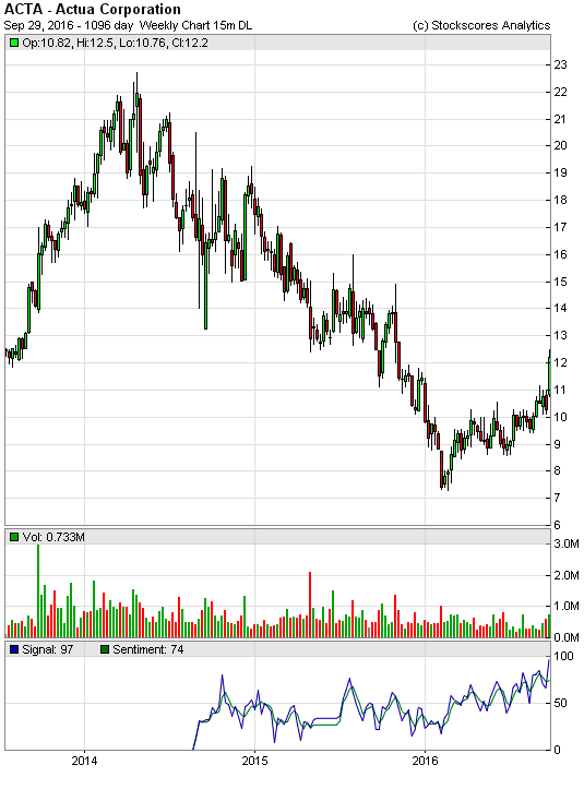
1. ACTA
ACTA has made a strong gain today which sets up a nice long term trend reversal pattern on the weekly chart.
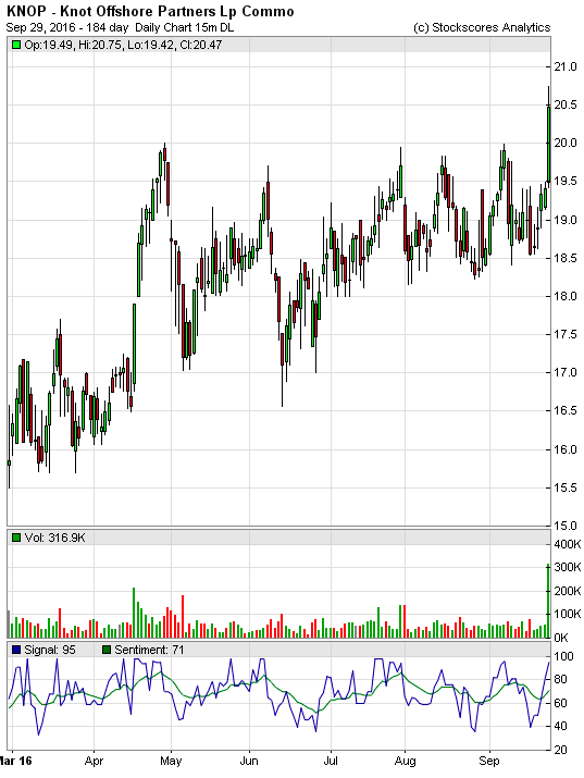
2. KNOP
KNOP is breaking from an ascending triangle pattern on the daily, giving it a break from a rising bottom on the weekly.
Alert: Don’t miss Michael’s great interview with the highly regarded Greg Weldon: On The Brink of Soaring Move In Gold & Silver
References
- Get the Stockscore on any of over 20,000 North American stocks.
- Background on the theories used by Stockscores.
- Strategies that can help you find new opportunities.
- Scan the market using extensive filter criteria.
- Build a portfolio of stocks and view a slide show of their charts.
- See which sectors are leading the market, and their components.
Disclaimer
This is not an investment advisory, and should not be used to make investment decisions. Information in Stockscores Perspectives is often opinionated and should be considered for information purposes only. No stock exchange anywhere has approved or disapproved of the information contained herein. There is no express or implied solicitation to buy or sell securities. The writers and editors of Perspectives may have positions in the stocks discussed above and may trade in the stocks mentioned. Don’t consider buying or selling any stock without conducting your own due diligence.